Understanding the Compound Component Pattern in React

React is a powerful library for building user interfaces, and one of its key strengths is its flexibility in how components can be structured and composed. One design pattern that has gained popularity among React developers is the Compound Component Pattern. This pattern offers a clean and intuitive way to build components that work closely together, providing both flexibility and maintainability. In this article, we'll explore what the Compound Component Pattern is, when to consider using it, how to implement it with examples, and the benefits it brings to your React applications.
What is the Compound Component Pattern?
The Compound Component Pattern is a design pattern in React that allows you to create a set of related components that work together seamlessly as a single, self-contained unit. These components share a common state or logic managed by a parent component, and each child component interacts with the parent and, indirectly, with each other. This pattern is particularly useful when you want to create highly flexible and reusable UI components that allow developers to compose and configure them in various ways.
When Should You Consider Using the Compound Component Pattern?
You should consider using the Compound Component Pattern in the following scenarios:
- Complex Component Interactions: When you have components that need to share common state or logic, such as a
Tabscomponent with multipleTabchildren or anAccordioncomponent with multipleAccordionItemchildren. The Compound Component Pattern helps manage these relationships more cleanly. - Reusable Component Libraries: If you are building a library of reusable components for use across different projects, the Compound Component Pattern allows you to build components that can be easily composed and configured.
- Flexible and Extensible Components: When you want to provide a high degree of flexibility to the developers using your components, allowing them to mix and match child components while still ensuring they behave correctly together.
- Encapsulation of Logic: When you want to encapsulate the state management and logic within a parent component while allowing child components to communicate with it seamlessly, the Compound Component Pattern is ideal.
How to Implement the Compound Component Pattern
Let's demonstrate the flexibility of the Compound Component Pattern using a more descriptive example. Imagine we're building a customizable form with various input components that can be dynamically composed depending on the specific use case. We will implement this pattern using meaningful component names such as TextInput, Checkbox, Select, and RadioButton. Each of these components will represent a different form field type, and they will be managed by a parent component (CustomForm) that controls the shared state.
Example: Building a Flexible Custom Form with Various Inputs

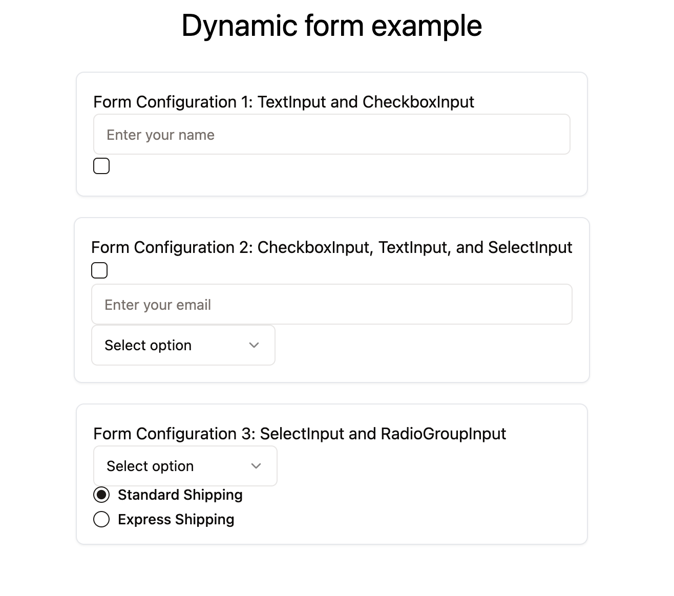
In this example, the CustomForm component is the parent that manages the shared state of the form fields. The child components—TextInput, CheckboxInput, SelectInput, and RadioButtonInput—are individual form elements that the developer can arrange in different combinations, depending on the specific form requirements.
Step-by-Step Implementation
- Create the Parent Component (
CustomForm): This component will handle the shared state management for all form fields. - Create Child Components (
TextInput,CheckboxInput,SelectInput,RadioButtonInput): Each of these components will represent a different type of input and interact with the parent component to update the form state. - Use React Context: We will use React Context to provide the form state and handlers to the child components without needing to prop-drill.
import React, { createContext, useContext, useState } from 'react';

// Create a context for managing form state
const FormContext = createContext();

function CustomForm({ children, initialState }) {
  const [formData, setFormData] = useState(initialState);

  const handleChange = (name, value) => {
    setFormData((prevData) => ({
      ...prevData,
      [name]: value,
    }));
  };

  return (
    <FormContext.Provider value={{ formData, handleChange }}>
      <form className="custom-form">{children}</form>
    </FormContext.Provider>
  );
}

function TextInput({ name, placeholder }) {
  const { formData, handleChange } = useContext(FormContext);

  return (
    <input
      type="text"
      name={name}
      value={formData[name] || ''}
      onChange={(e) => handleChange(name, e.target.value)}
      placeholder={placeholder}
    />
  );
}

function CheckboxInput({ name, label }) {
  const { formData, handleChange } = useContext(FormContext);

  return (
    <label>
      <input
        type="checkbox"
        name={name}
        checked={formData[name] || false}
        onChange={(e) => handleChange(name, e.target.checked)}
      />
      {label}
    </label>
  );
}

function SelectInput({ name, options }) {
  const { formData, handleChange } = useContext(FormContext);

  return (
    <select
      name={name}
      value={formData[name] || ''}
      onChange={(e) => handleChange(name, e.target.value)}
    >
      <option value="">Select an option</option>
      {options.map((option) => (
        <option key={option.value} value={option.value}>
          {option.label}
        </option>
      ))}
    </select>
  );
}

function RadioButtonInput({ name, value, label }) {
  const { formData, handleChange } = useContext(FormContext);

  return (
    <label>
      <input
        type="radio"
        name={name}
        value={value}
        checked={formData[name] === value}
        onChange={(e) => handleChange(name, value)}
      />
      {label}
    </label>
  );
}

// Assign child components to the parent component
CustomForm.TextInput = TextInput;
CustomForm.CheckboxInput = CheckboxInput;
CustomForm.SelectInput = SelectInput;
CustomForm.RadioButtonInput = RadioButtonInput;

// Usage examples
function App() {
  return (
    <div>
      <h2>Form Configuration 1: TextInput and CheckboxInput</h2>
      <CustomForm initialState={{ name: '', agree: false }}>
        <CustomForm.TextInput name="name" placeholder="Enter your name" />
        <CustomForm.CheckboxInput name="agree" label="I agree to the terms" />
      </CustomForm>

      <h2>Form Configuration 2: CheckboxInput, TextInput, and SelectInput</h2>
      <CustomForm initialState={{ subscribe: false, email: '', plan: '' }}>
        <CustomForm.CheckboxInput name="subscribe" label="Subscribe to newsletter" />
        <CustomForm.TextInput name="email" placeholder="Enter your email" />
        <CustomForm.SelectInput
          name="plan"
          options={[
            { value: 'basic', label: 'Basic Plan' },
            { value: 'premium', label: 'Premium Plan' },
          ]}
        />
      </CustomForm>

      <h2>Form Configuration 3: SelectInput and RadioButtonInput</h2>
      <CustomForm initialState={{ paymentMethod: '', shipping: 'standard' }}>
        <CustomForm.SelectInput
          name="paymentMethod"
          options={[
            { value: 'creditCard', label: 'Credit Card' },
            { value: 'paypal', label: 'PayPal' },
          ]}
        />
        <CustomForm.RadioButtonInput name="shipping" value="standard" label="Standard Shipping" />
        <CustomForm.RadioButtonInput name="shipping" value="express" label="Express Shipping" />
      </CustomForm>
    </div>
  );
}

export default App;
Key Points to Note in the Example
- Dynamic Composition: The
CustomFormcomponent demonstrates how you can dynamically compose different child components (TextInput,CheckboxInput,SelectInput,RadioButtonInput) to create various form configurations, depending on your application's needs. - Encapsulation of Logic and State: The parent component (
CustomForm) encapsulates the state and logic needed to manage the form inputs. This allows each child component to remain focused on rendering and interacting with its specific input type, while the parent manages state updates centrally. - Flexibility and Reusability: Each child component is reusable and can be composed in any order or combination within the
CustomForm. This flexibility allows developers to easily create new form configurations without modifying the underlying components. - Improved Developer Experience: By using the Compound Component Pattern, developers have a clear and consistent way to build forms, reducing boilerplate code and making the form components easier to use and maintain.
Benefits of the Compound Component Pattern
- Clean and Manageable Code: By grouping related components together and managing their interactions centrally, the Compound Component Pattern reduces complexity and keeps the codebase clean.
- Encapsulation and Separation of Concerns: The pattern encapsulates the state management logic within the parent component, keeping individual components focused on their specific roles. This separation of concerns aligns with React's principles of reusable and maintainable components.
- Flexible and Extensible Design: The pattern provides a flexible way to build components that can be easily reused and composed in different ways, accommodating various application requirements without additional boilerplate code.
- Simplified State Management: Shared state is managed centrally in the parent component, eliminating the need for prop drilling and reducing the chances of state inconsistencies.
Conclusion
The Compound Component Pattern is a powerful technique for building flexible, reusable, and maintainable React components. It allows developers to create dynamic component compositions, encapsulate logic and state management, and provide a better developer experience. By understanding and utilizing this pattern, you can significantly enhance the quality and scalability of your React applications.


Comments ()